


Today, we’re proud to unveil a new brand and the expansion of our digital closing platform.
Why rebrand, and why now?
We’ve grown—a lot. Snapdocs has transformed significantly over the past few years, and we’re far from the company we were at our founding in 2013. We started by automating the process of selecting and scheduling high-quality notaries, a critical component of the mortgage closing experience. Since then, our market, our vision, and our product offering has evolved. Today, we power 1 in 4 mortgage transactions, serve a wider range of mortgage participants, and automate multiple complex interactions before, during, and after the closing. This evolution led us to reflect on who we are and how we show up in the world.
Our journey
To thoughtfully shape our brand, we gathered input from across our team, customers, and partners. We listened closely to how others perceive Snapdocs when we're not in the room—what value we bring, how our story resonates, and where it falls short. It was essential for us to involve the people who helped build Snapdocs into what it is today, ensuring their voices guide who we become in the future.
Defining our brand story
A common theme emerged: people are at the heart of everything we do. For generations, homeownership has been central to the "American Dream." Yet, buying a home and closing on a mortgage is a long, stressful, and still mostly manual process—not just for borrowers, but for the professionals who serve the industry.
The root cause of this frustration lies in the fragmentation between the people, processes, and technologies involved in a mortgage closing. That’s why we’ve increased our focus on connection, specifically between lending and settlement teams and other points of coordination across the transaction.
We understand that while great technology is essential, it must work hand-in-hand with a people-centric approach to drive meaningful digital adoption. This realization has shaped our thinking and strengthened our commitment to delivering seamless, connected experiences for everyone involved in these critical transactions.
- Our mission is to automate the mortgage process by connecting the people, processes, and technologies that power the industry. This guides how we build our platform, collaborate with industry partners, and operate day to day.
- Our tagline is "Make mortgage a snap." This reflects our belief that closing on a mortgage should be simple. While “docs” may be in our name, our innovation goes beyond document digitization. We’re automating every critical interaction between key parties in the closing process, empowering our customers to fully realize the value of automation.
- Our brand voice focuses on four principles: make it snappy, put people first, be positive & action-oriented, share expertise without ego. By embracing these traits, we consistently communicate with clarity, certainty, and a genuine connection in service of our customers.
This brand story reflects our dedication to serving mortgage participants and empowering borrowers on their digital journey to homeownership. It naturally led to a new look that vividly captures the Snapdocs story, ensuring we deliver what we promise to our customers.
These are some of the changes you might notice and the inspiration behind them.

Putting the pieces together, and in motion
Like a mortgage closing, our visual brand needs to be multidimensional and scalable to grow with us and our customers. Our visual brand centers on four key elements:
- Connection: representing the people, processes, and technologies involved in a mortgage closing
- Vibrancy: introducing a new color palette and shade of our signature orange
- Motion: showcasing the workflows that drive the industry
- Simplicity: mirroring the ease we strive to bring to the mortgage closing process
We began by exploring how to visually express the idea of connection, the core concept of our mission. That’s where the block comes in—a symbol of stability, simplicity, and adaptability. Whether stacked, rotated, or connected, these blocks represent Snapdocs’ reliable and interconnected technology. Just like the blocks used to build a home, our block is a 3D, dynamic element. Its versatility symbolizes Snapdocs’ ability to reimagine and innovate.
As the blocks snap into place with motion and sound, layered with our entire system, our story unfolds.
Our new logo embraces color and connection
Our new logo features a lowercase “s”, reflecting Snapdocs’ approachable and humble personality. The bold, sturdy font complements our block concept, while conveying the expertise we’ve built—helping customers achieve digital closing adoption at 3X the industry average and eNote adoption at 2X the industry average.1
The logomark, positioned at the end of the logo, defies convention. It anchors our brand and points toward the future. The angular line through the block captures the moment before two pieces snap together, symbolizing growth through its upward trajectory. It also subtly forms the shape of an "S," a nod to our name.
![]()
Snapdocs is often associated with the color orange—evoking feelings of optimism, warmth, and confidence. We’ve embraced this by retaining our signature orange, evolving it into a fresh, vibrant tone that’s more accessible and unmistakably Snapdocs.
As shapes and movement convey the nature of a mortgage closing, we’ve expanded our color palette to be more flexible and extensible for years to come. From bright neons to grounding tones, these broader range of colors help hero our signature orange and reflect the diversity of our product offerings. We also introduced gradients, which much like our block concept, add depth and dimension to our storytelling in an increasingly 3D and digital world.
Illustrating the message
This distinctive color palette guides our audience, highlights key information, and inspires action—especially through our iconography. Our bespoke illustrated icons leverage the dimensionality of our logo, allowing us to tell more detailed, unique stories.

Photography—the human side of our technology
We’re more than just a technology company. Our team is committed to ensuring digital closing success, understanding how crucial each mortgage transaction is, and the many people involved in making the borrower’s experience smooth and celebratory. Our photography style reflects this, focusing on genuine, candid moments that showcase the human side of the mortgage process.

Our emotive typeface
Our selection of Acid Grotesk strikes the perfect balance between professionalism and personality. Grotesk (also known as Grotesque) fonts are known for their geometric lines, angular shapes, and irregular forms. They often have varying contrasts between thick and thin, and their square-like shapes and curves nod back to our central block concept. Much like our approachable brand voice, this modern, versatile typeface captures both the seriousness of the mortgage industry and the joy of homeownership.

A cohesive brand for a connected experience
People are at the heart of everything we do. Whether you’re a lender, a title company or settlement team, a notary, a secondary market participant, or a borrower, Snapdocs is here to improve your experience with efficiency, ease, transparency, and quality.
Every element of our new brand reinforces that promise, and this is just the beginning. Thank you to our customers and partners for your ongoing trust and collaboration as we deliver solutions that make mortgage a snap.
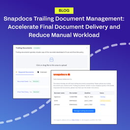
Learn more about the product expansion that inspired our brand here.
1 Data derived from total loan volume transacted on the Snapdocs platform from January 2023 to July 2024, alongside research conducted by Arizent on the top 100 mortgage lenders.